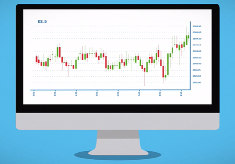
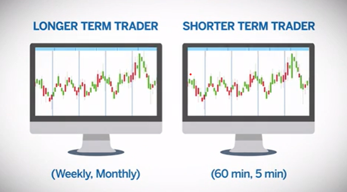
Trading charts are fundamental in the technical analysis of futures markets, as they allow for the visualization of price movements and the application of indicators for decision-making. Traders can set up these charts in various time frames and visual styles, choosing the most suitable one according to their trading strategy, whether it’s long-term with weekly or monthly charts, or short-term with 60-minute or 5-minute charts. The most common types of charts are candlestick, bar, and line charts, each offering specific advantages for identifying market trends, reversal signals, and consolidation periods. The selection of the chart type and time frame is based on the individual preferences of the trader and their analysis approach.
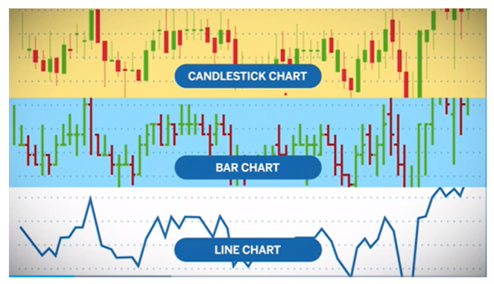
CANDLESTICK CHARTS
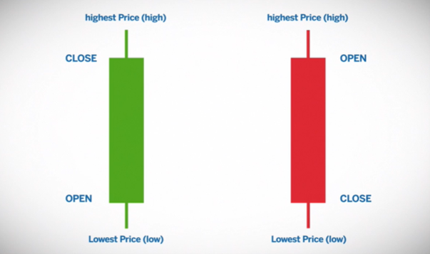
Japanese candlestick charts visually represent price using a body and wicks, mimicking the shape of a candle. The wicks indicate the highest and lowest prices, while the body shows the opening and closing prices over a specific period. The color of the body varies (usually green for a close higher than the open and red for the opposite), depending on the color settings of the software used.
USING CANDLESTICK CHARTS
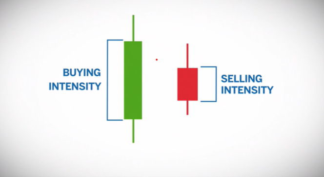
Candlestick charts allow traders to visualize buying and selling pressure in two ways:
- The size of the body indicates the intensity of buying or selling.
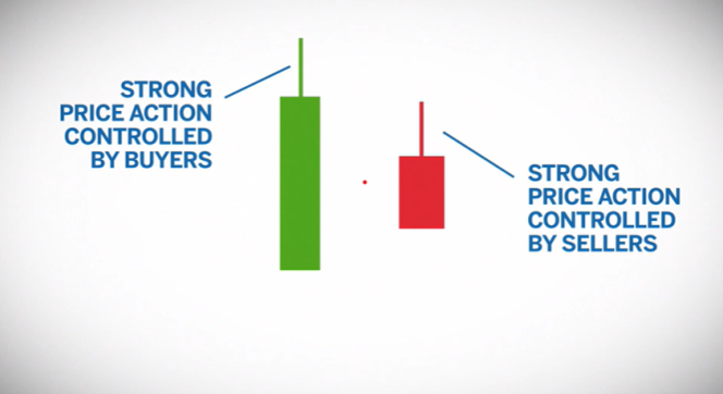
- The size of the wick relative to the body is important in determining who was in control: whether it was buyers (green candle), sellers (red candle), or both.
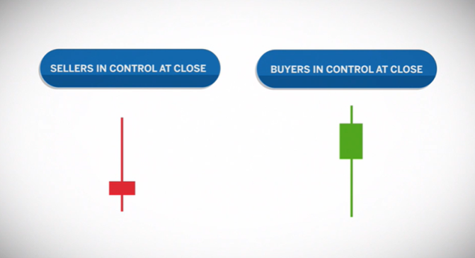
- Additionally, the location of the body relative to the bar can indicate who took control at the close: whether it was sellers dominating at the end (body near the low) or buyers (body near the high).
READING GAPS
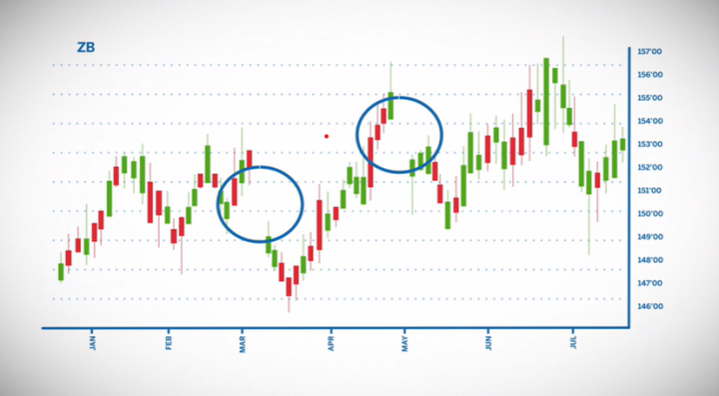
Candles that gap above or below the previous candle are an indication that there is momentum in the trend. For example, 30-Year Treasury Note futures (ZB) gapped down twice on this daily chart and continued to push down after the gap.
LINE CHARTS
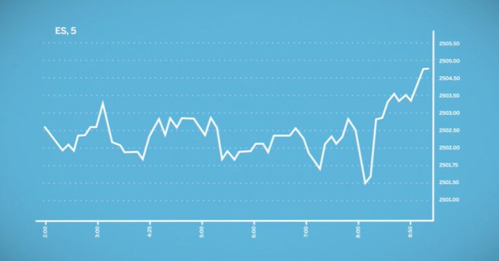
The line chart provides a quick way to visualize long-term trends by representing the closing price for a given period of time. Unlike candlestick charts, which allow for a more detailed analysis of prices, the line chart focuses on providing an overview of the overall market direction.
BAR CHARTS
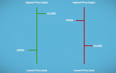
The bar chart, also known as an OHLC chart, is similar to the Japanese candlestick chart but with some visual differences. It provides four data points for each period of time: opening price, high, low, and closing price. The opening is shown with a horizontal line on the left, the closing on the right, and the highs and lows with the vertical line of the bar. This type of chart allows for easy visualization of price movement and trend determination.
APPROACHING READING CHARTS
As a trader, you will need to set how often a new candlestick or bar appears on your chart using either a time-based approach or trade-based approach.
TIME-BASED CHARTS
Time-based charts generate a new bar or line point after a set amount of time has passed. Depending on your preferences, this can be anywhere from one minute to a week or year.
TRADE-BASED CHARTS
An approach based on trading operations uses a “tick chart” to visualize the momentum behind price movements. This type of chart generates a new bar or line point after a specific number of trades. For example, a new bar may be generated every 25 trades or after 512 trades. Short and long-term tick charts offer different perspectives of the market, while a 5-minute chart differs significantly from a 512-tick chart. During periods of high volume, tick charts generate new bars faster, while during periods of low volume, they do so more slowly. The speed at which new bars are formed allows traders to better visualize changes in market volume. Charts, along with other data, help guide opinions about price direction and can be adjusted to illustrate the most relevant information for each trader.